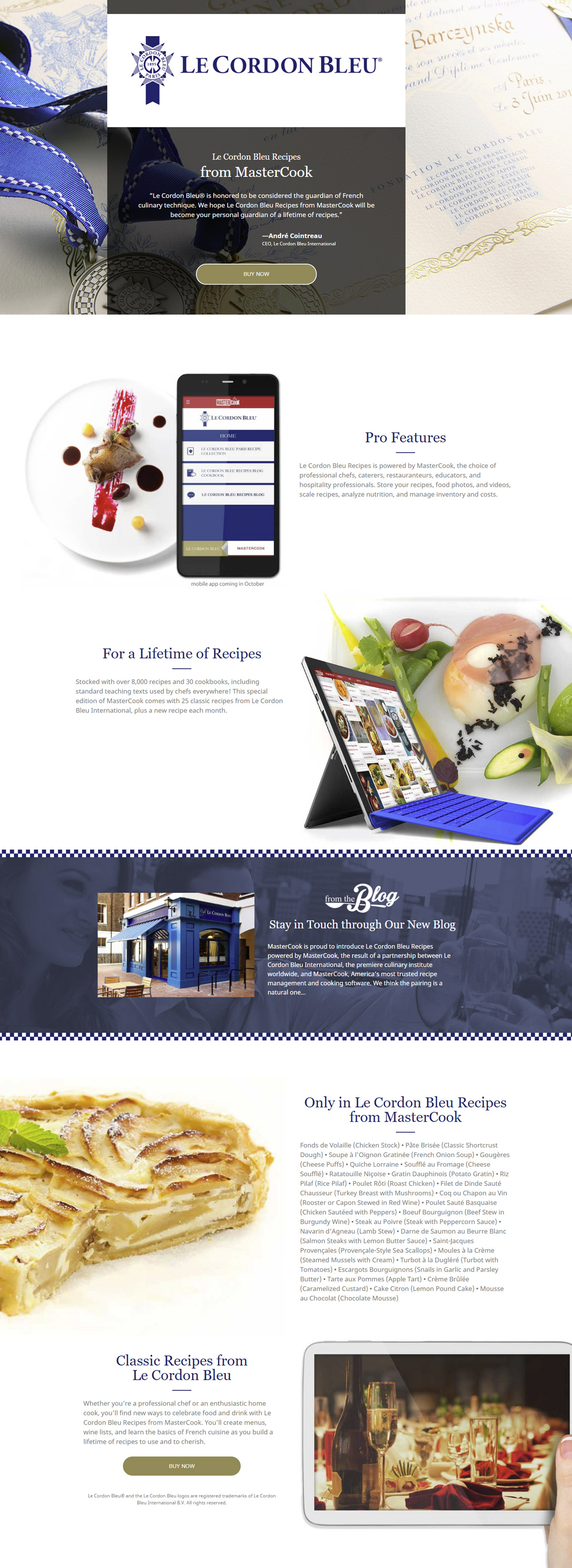

The Le Cordon Bleu apps were developed in partnership with the world reknowned culinary school of the same name. The apps provided the user with exclusive access to recipes stemming from Le Cordon Bleu. Working with the marketing department, and design leads of Le Cordon Bleu, located in Paris, I succesfully created a homepage that refelcted the aestheic of the organization.
Image is everything, not everything but it can be overwhelmingly helpful to sell a brand. We are all familiar with the Le Cordon Bleu, one of the great culinary institutes of our time. I too, have a handful of friends who have graduated from these places of gastronomic education, and have proceeded in careers that delight the senses. A great dish engages all the senses, taste, touch, sight, smell and even sound--the crunch-crunch you hear inside your dome the moment your teeth crush a vibrant piece of celery. To properly convey what Le Cordon Bleu was all about, I was only able to work with sight. Too bad screens aren’t scratch and sniff… maybe not yet. Even though the product was digital, I needed to make it eye catching. Selling a car without a picture of the car is difficult, selling a food app without a picture of food is even harder. Even though I was given a repository of images, not all those images were publishable. I have plenty of experience working with big brands and all these brands have style guides, usually very detailed style guides, Le Cordon Bleu was no different. I realized while working through their style guide and limited image repository that sometimes less is more. Keeping things simple around logo areas, especially for an elegant institution like Le Cordon Bleu works best. Using white space was key. I didn’t need all those images, because when a brand is already well branded, I need to let it speak for itself and that I did.

Anyone who's tried working within the constraints of a very detailed style guide knows it is both a blessing and a curse. As beautiful the Le Cordon Bleu logo is, it is more at home in print rather then web. Granted, most logos do adhere to a guideline that require predetermined whitespace, the Le Cordon Bleu logo posed a special challenge because of the height of the ribbon emblem versus the actual Le Cordon Bleu font.
There needed to be a balance of whitespace, but at the same time I needed to respect the brand's identity giving it enough breathing room. After some trial and error, the most visually striking way to do it was to simply put the logo in a white box. And it I thought it worked great. The design was approved by the Paris the Le Cordon Bleu team and the rest of the design went into production. For the most part, after figuring out the logo, like many other projects I've tackled, the rest of the page just kind of fell into place.

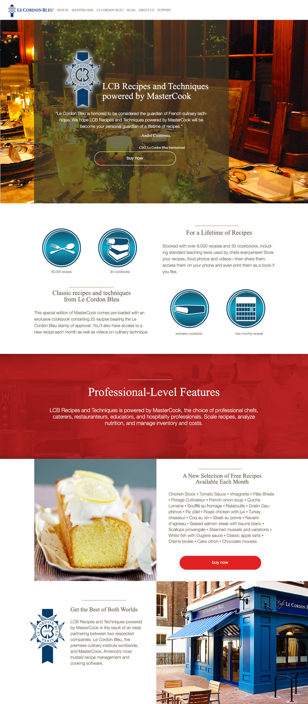
This was a version I created before the assets were receieved from Paris. Notice the logo is not distinct and lacks punch. Of course, after I received the style guide, I made the needed corrections and as stated above, having the logo correctly placed shaped the rest of the page. I also created four icons but in the end decided not to use them because it did not match the final style of the page.